


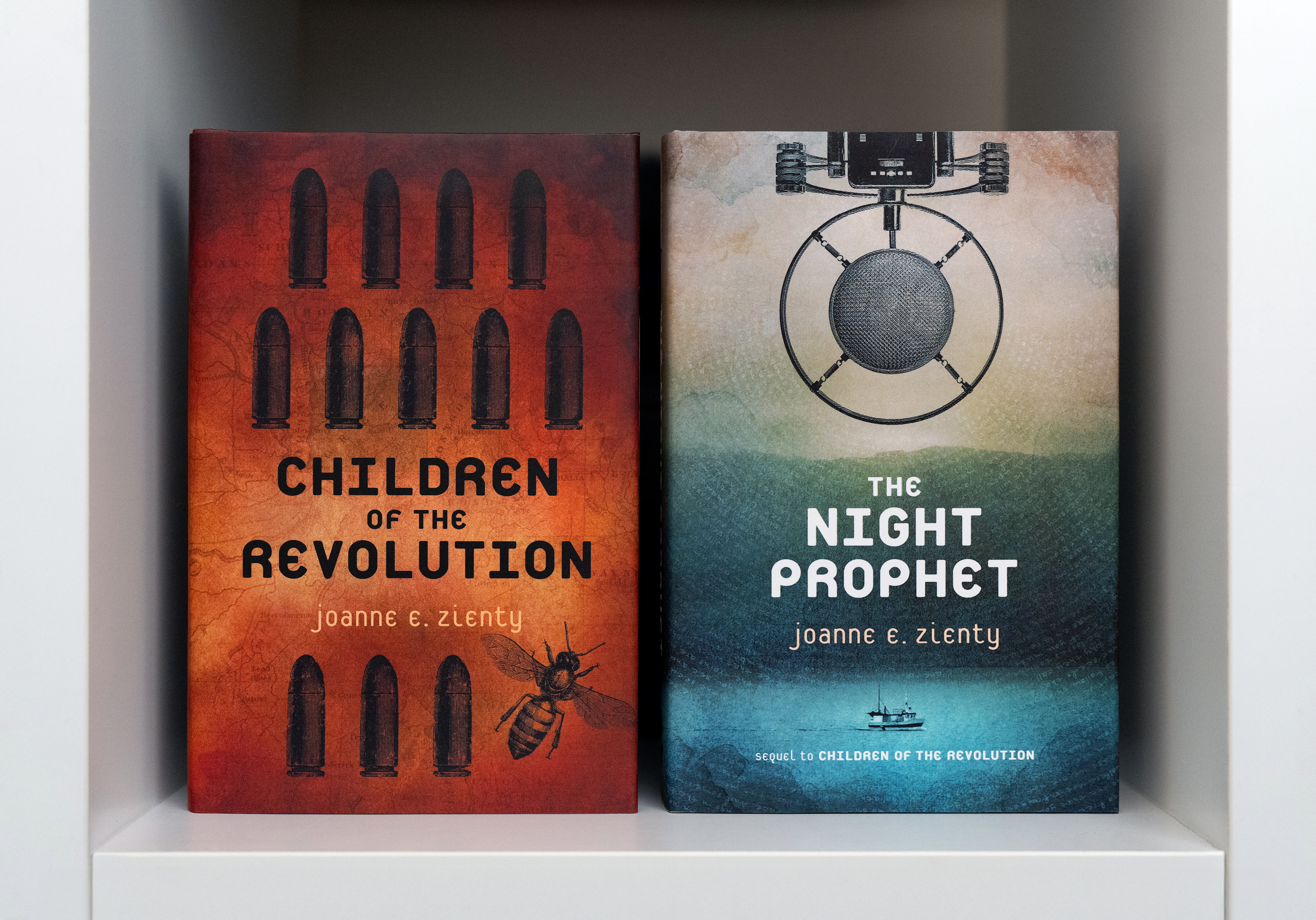
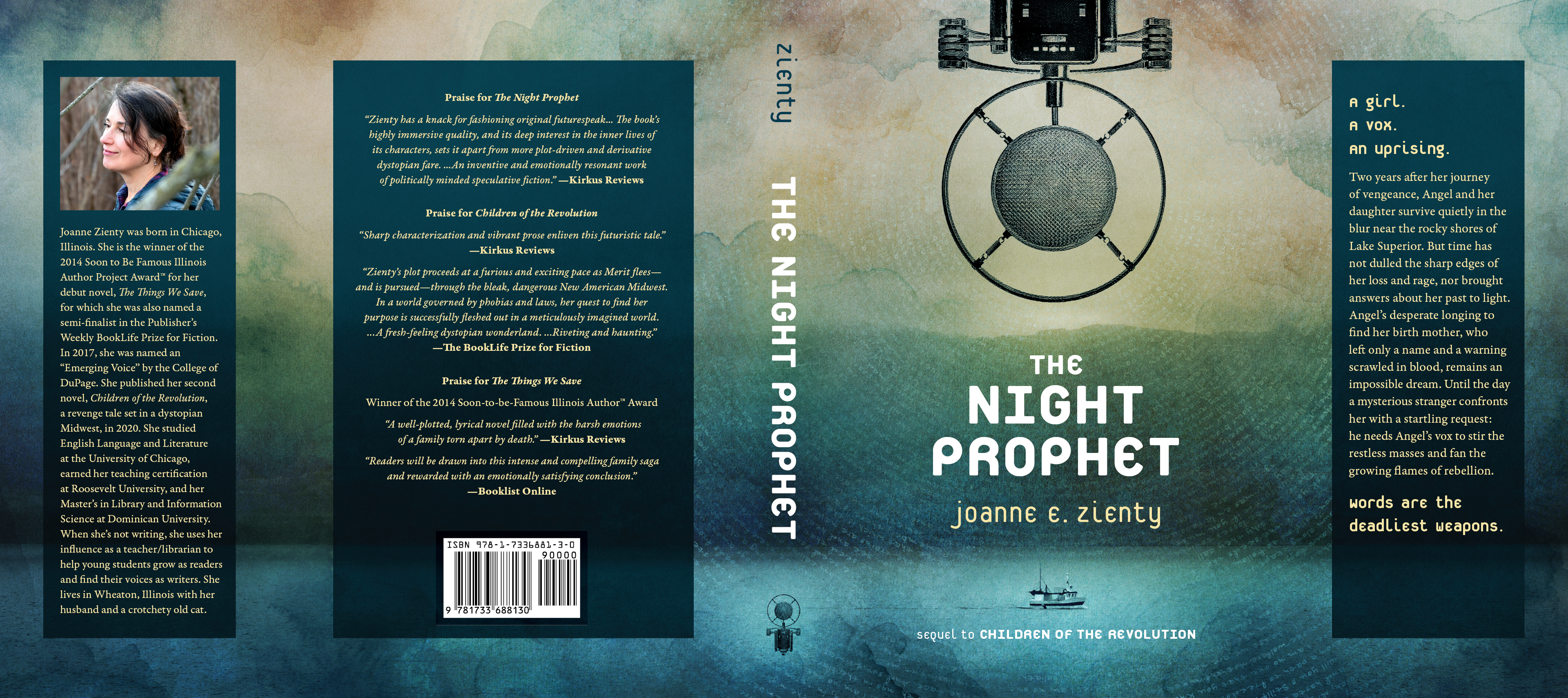
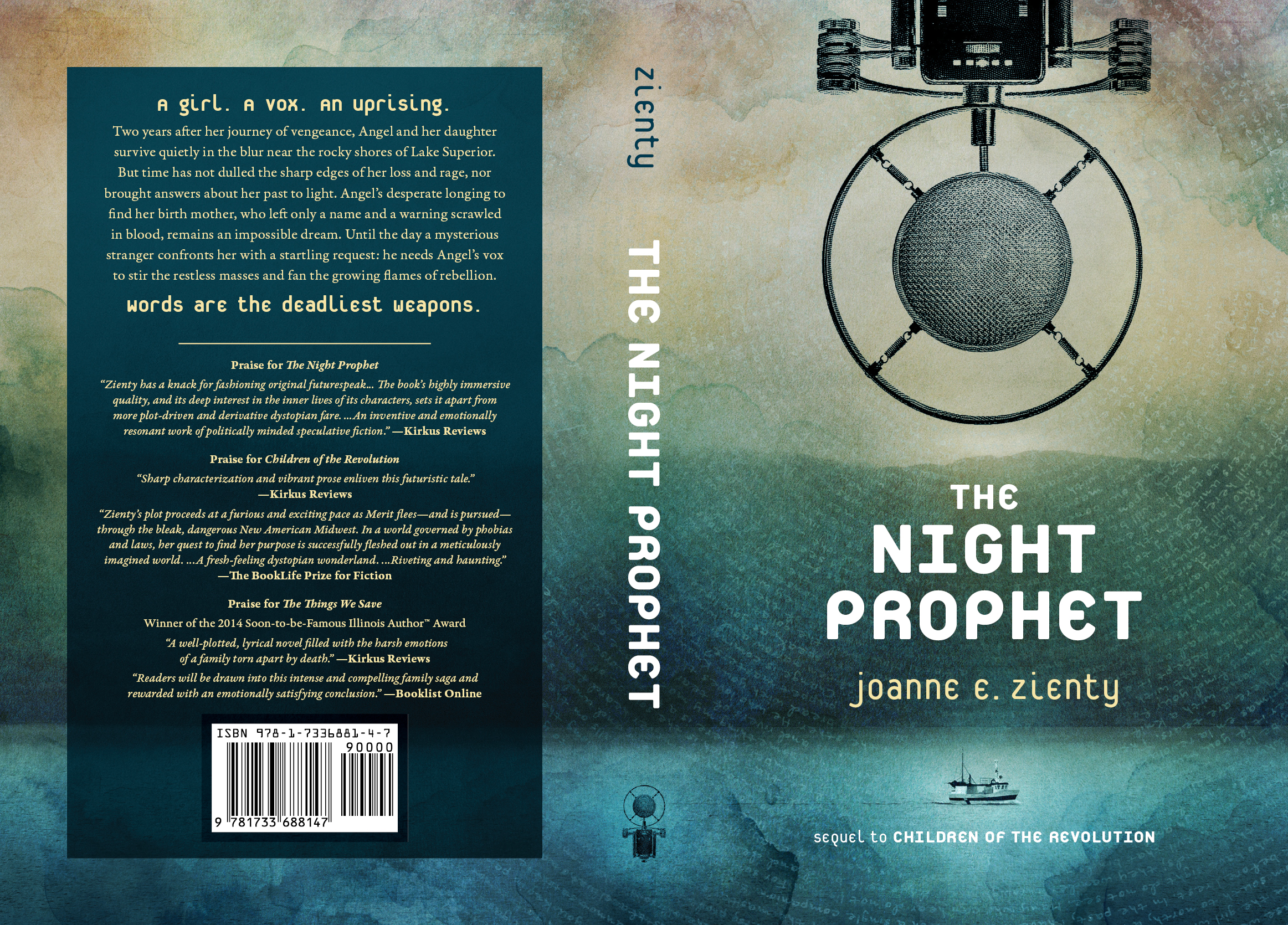
These stories are set decades in the future, but are grounded by the presence of technology and objects from our time—characters preserve old books, mend rundown bicycles, and repurpose early-aughts audio equipment. We’re given glimpses of futuristic tech and culture, enjoyed only by a privileged few, but the protagonists’ everyday reality feels worn-out and grimy, weathered after decades of use and repair. I tried to capture that duality in the cover art and typography. Heavily stylized symbols invoking antique instruction manuals are superimposed over faded, water-stained textures: for Children of the Revolution, twelve bullets and a bee are stamped on an old map of Illinois; The Night Prophet features a microphone and fishing boat over an eerie landscape, foreboding and hopeful, with the protagonist’s words radiating outward like sound waves or ripples in water. The monospace font Platelet feels simultaneously futuristic and recognizable; based on contemporary license plates, it’s a subtle nod to the characters’ trek across the Midwest.
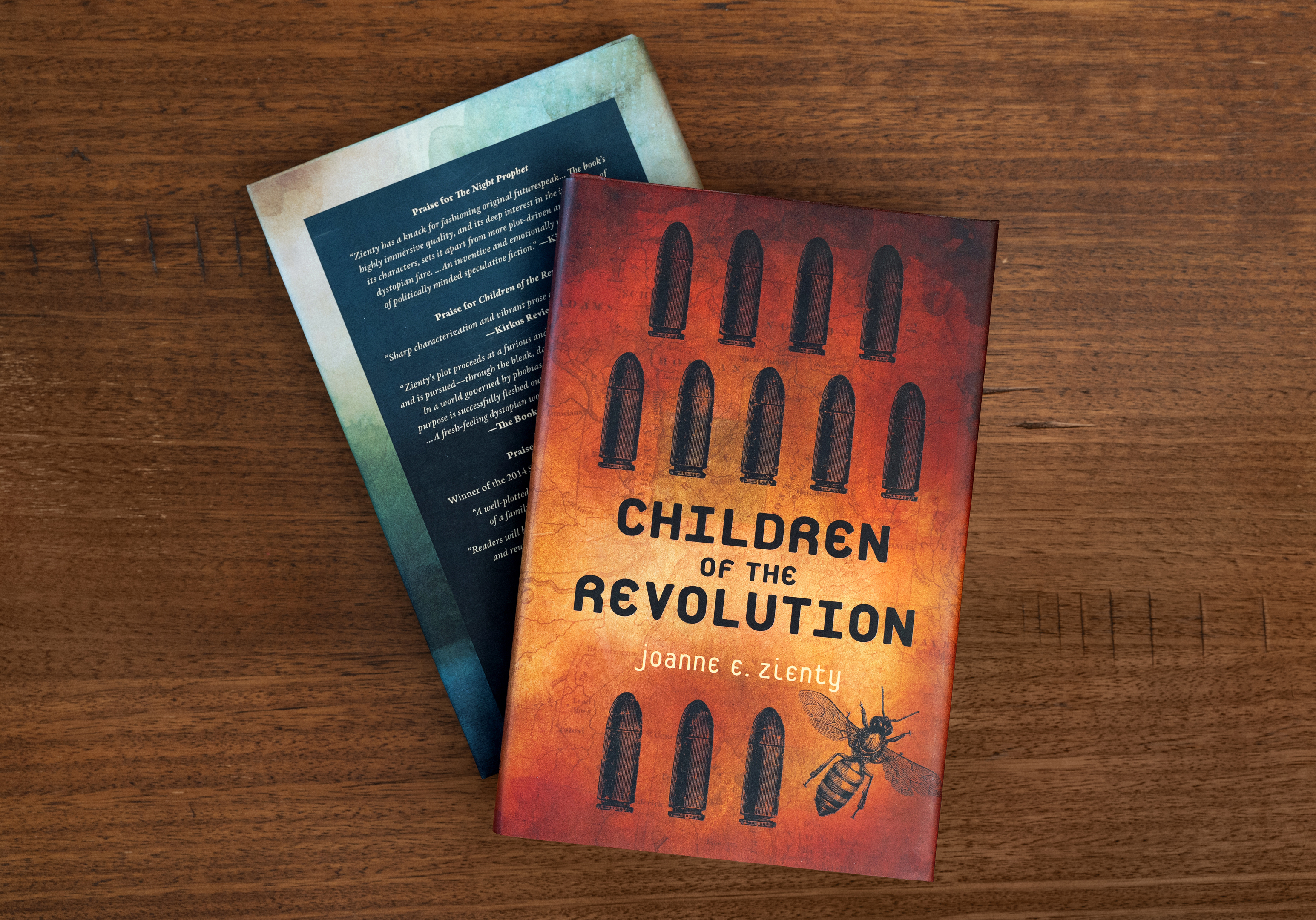
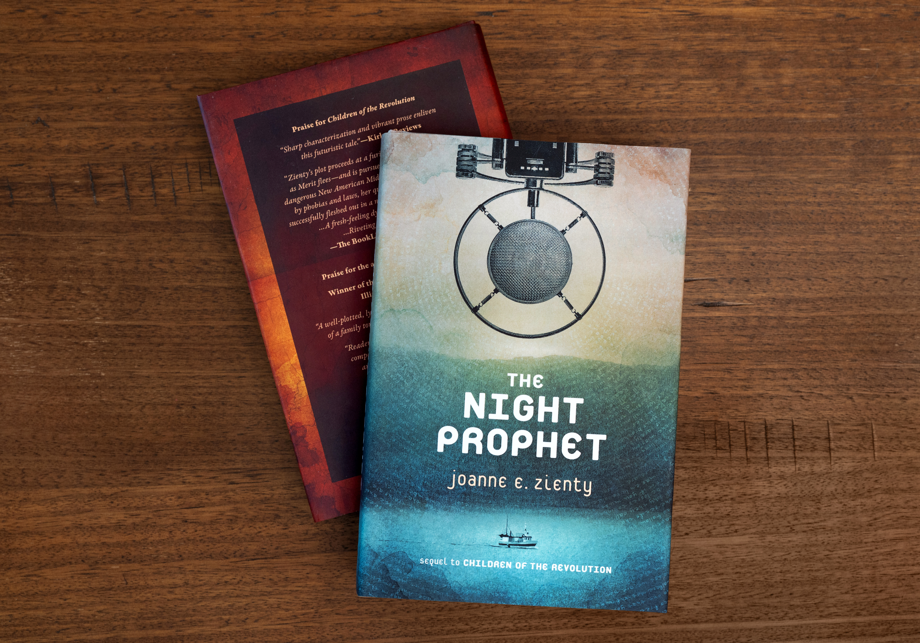
Pictured above are the hardcover editions; the author also published paperback and eBook editions, each of which presented a series of interesting design challenges. Below is a comparison between The Night Prophet‘s unfolded dust jacket, which allowed for a luxurious spread of information, versus the more economical layout required for the paperback.


Above, selections from the interiors of both books.
Titles, chapter headings, and other display text are set in Platelet, designed by Conor Mangat of Emigre. Body and other incidental text is set in Garamond Premier Pro, designed by Robert Slimbach (after Claude Garamond and Robert Granjon) of Adobe.