RespondAbility Platform & Website Refresh
RespondAbility is a collaborative strategic execution and initiative management platform built by educators for educators. Comparable in some ways to project management tools like Basecamp and Monday.com, RespondAbility is designed specifically for schools and school districts and provides a comprehensive platform for consolidating and tracking work on every scale—from short-term individual projects to broad district-wide goals—in one easy-to-use dashboard. They partner directly with clients to analyze the school/district’s goals and challenges, configure the client’s unique dashboard based on those findings, and provide ongoing training and leadership coaching for continuous improvement.
In the fall of 2020, RespondAbility was in the early stages of revamping the platform’s UX and UI, and Founder/CEO Gavin Doughty approached me to help with the redesign. Rather than undertaking a full rebrand, the goal was to maintain and build upon the company’s existing brand equity while updating their most important assets—the platform, the website, and related informational collateral—with a fresh, consistent look and feel. I worked closely with RespondAbility leadership on the platform and collateral refresh, and later partnered with fellow designer Cori Lewis and strategist Laura Hooper Doughty to update the website.
Below are several examples of my work refreshing the RespondAbility platform, with the original designs for comparison. My aim was to update and improve upon the existing material: creating a more clear and intuitive UI, a seamless and consistent UX, and a stronger brand presence throughout. These mockups were created using Adobe XD.
On the main dashboard, RespondAbility users can toggle between several layouts for organizing and viewing their tasks—the month-by-month Calendar view, the detailed Task List view, and the process-focused Kanban view. These functions were already in place, but the existing designs felt cramped and difficult to read at a glance; the muted colors, low-contrast buttons, and lack of visual breathing room were some of the first issues I tackled. RespondAbility’s brand colors play an important role in the platform’s design, each representing one of the four primary Task/Rock statuses (Not Started, On Track, At Risk, and Off Track) and providing a consistent visual shorthand at every level.
Above, my updated designs for the Dashboard—Kanban View (left), the Dashboard—Task List View (top right), and the Task Status Flyover and Menu Dropdown (bottom right).
After several rounds of design and feedback, the mockups were ready to move into development. At this stage, my design work shifted from the RespondAbility platform to various pieces of related collateral (below).
At right: several one-page info sheets, and a selection of graphics included in project proposals. Here, the goal was to create a consistent visual language for outward-facing materials, a letterhead template and easy-to-replicate style guidelines, and a set of graphics for use across multiple types of collateral. The RespondAbility logo formed the basis for several repeating motifs—a sense of forward momentum in the footer; work moving in a positive red-to-green direction when integrated into a cycle or used as an elipses.


At right: selections from the introductory slide deck presented to potential clients.


The next phase of the project was updating RespondAbility’s website top to bottom—not merely refreshing the visual style, but also restructuring the navigation, reorganizing content, and enlivening the language and calls-to-action to drive user engagement. Below is a scroll down the updated homepage—the platform’s first point of contact with many prospective clients—followed by a closer look at some key areas of the site we addressed.

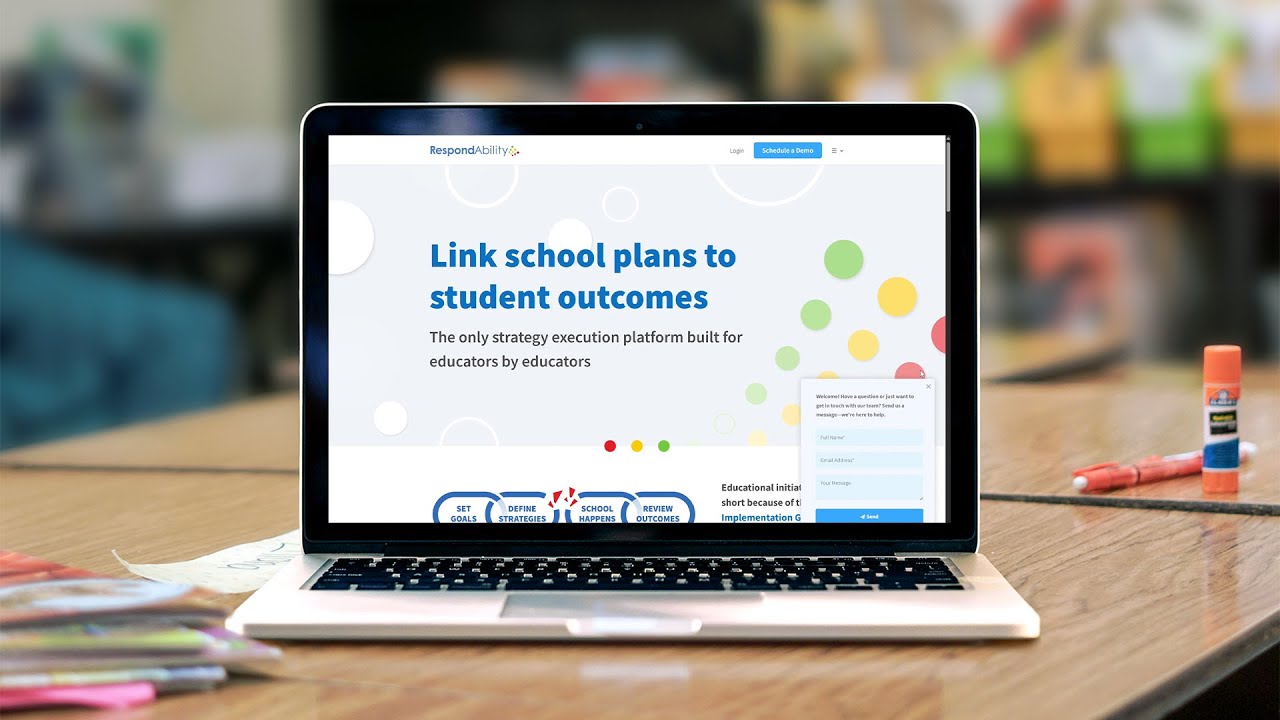
The RespondAbility homepage serves to drive user engagement—to give prospective clients a broad overview of the product, provide inroads toward more specific information, and to prompt requests for in-person demos. Cori Lewis, Laura Hooper-Doughty, and I worked together to craft strong, consistent, and engaging messaging sitewide. At the same time, Cori and I collaborated on the site’s look and feel, expanding upon the visual language I had previously developed for the platform and collateral.
We highlighted user testimonials and project management examples from the platform to embolden prospective clients with a sense of confidence in the RespondAbility team and the seamless user experience they can expect from the platform. Specific calls to action conclude each page of the site, always paired with a button to schedule a demo.
See more at the RespondAbility website.